Staples Built a Button for What Not to Do
Published on 9 October, 2026 | Author: Agnes Marggs | 4 min read
Somewhere in Staples’ new ad campaign, a store employee slides a roll of toilet paper under a bathroom stall door because the restroom ran out mid-shift, and a sign meant to read “Shirts” gets printed as something considerably ruder instead. These are the Hard moments. Then a Staples delivery person appears, soap gets restocked before anyone notices it was gone, and the sign prints correctly the second time. These are the Easy moments. The whole campaign runs on that one repeated beat.
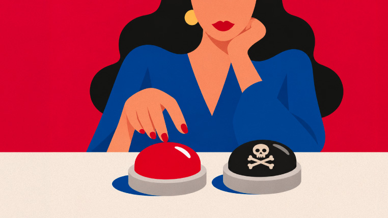
Staples marked its 40th anniversary on September 15 by launching Hard vs. Easy, a new brand platform built around a black counterpart to its iconic red Easy Button. CEO Rachel Huckle framed it as the same 40-year promise in new form, saying the company would “show the Hard, then present the Easy way forward.” The physical Hard Button now sits beside the original, each one a visual shorthand for a choice rather than a product. Staples’ own release states that 75% of the Fortune 500 already work with its business account teams, which is the audience this campaign is actually built for.
What actually happened here is a brand adding a second icon rather than replacing the first one. The Easy Button has been resurrected, retired and revived multiple times since 2005, most recently as a social-first mascot called E.B. last year. This time, Staples didn’t touch the original at all. It built a foil instead, which does something a solo icon cannot: it turns every workplace annoyance the company wants to sell against into a visible character with a color and a shape, not just a mood.
Name the mechanism plainly. A single mascot represents a feeling. A paired mascot represents a decision, and decisions are what actually drive a purchase. The Hard Button does not need its own personality, because its entire job is to make the Easy Button’s personality legible by contrast. That is a cheaper creative problem to solve than building two fully realized characters, and a sharper one to remember.
The mechanism alone does not explain why this campaign leans as hard as it does into office-specific scenarios, restroom supplies, misprinted signage, vendor sprawl. CMO Bob Sherwin told the Boston Globe the company wanted to “juxtapose working with Staples versus the alternatives,” built with agency Bandits & Friends on concept and Monks on production. That is the real story sitting underneath the anniversary framing. Staples’ consumer business has been shrinking against Amazon for years. Its B2B side, furniture consultations, janitorial contracts, breakroom stocking, is the part the company considers undervalued, and this campaign is a 40-year-old mascot doing enterprise procurement marketing.
That is the part worth sitting with if your own brand still gets treated like a consumer-facing name internally, even after your revenue mix has quietly shifted toward accounts, contracts and enterprise buyers. Staples didn’t launch a new B2B sub-brand or a separate enterprise identity to make that pivot. It reused the asset everyone already trusted and pointed it at a different buyer.
What does distinctiveness look like here, concretely? It is not the button itself, plastic novelty items are cheap to make. It is the discipline of tying every scenario back to a specific, named Staples service rather than a vague promise of ease, so a facilities manager watching the ad can map “Hard” directly onto a problem they actually have this week.
Run the test on your own company. Find the thing your buyers already associate with you, even if it feels dated or oversimplified, and ask whether you have ever pointed it at a new audience instead of retiring it for something more sophisticated. Staples bet that 20-year brand equity beats a rebrand, and aimed a genuinely goofy prop at a genuinely serious buyer.
The sign still says the wrong thing in the Hard version. That’s the point. Everyone remembers the mistake, so everyone remembers the fix.
Recommended Post