Instagram Fixed a Logo Nobody Complained About. Now It Reads Like a Ransom Note.
Published on 26 August, 2026 | Author: Agnes Marggs | 4 min read
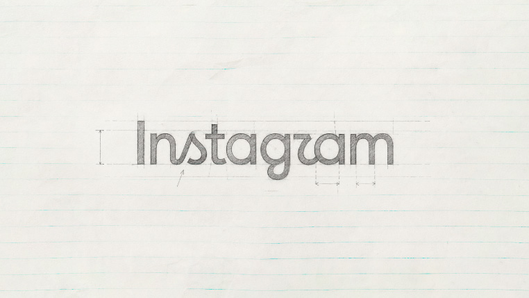
Read Instagram’s new logo out loud. Go on. Most people get it wrong on the first try — that stumble isn’t a glitch, it’s the entire pitch. Somebody on X actually searched “we want Instagram to change its wordmark” just to check. Zero results. Nobody, anywhere, had asked for this. Instagram did it anyway, unveiling its first wordmark update since 2016 on Thursday, August 13, with Adam Mosseri announcing it in the tone of a man who already knows the discourse is coming and has made peace with it. The old type had gone “unchanged for 10 years,” he said, and the new one was “sharper and more modern.” The pink camera icon, the part people recognize at a glance, stayed exactly where it was.
Here’s the reasoning nobody asked for, either. Director of Product Design Jasmine Probst said the team ran through hundreds of typefaces before landing back on cursive: “Script reflects individuality, so referencing that felt right… It evokes personal expression and personal voice.” Translation: in a world where TikTok has quietly become the app where being a person happens, Instagram wanted its own name to feel less like a UI element and more like a signature.
The internet did not receive this as intended. One user compared the new font to “a wedding invite” ten years too late to the redesign party. Multiple people started reading it as “Instagzam,” others as “Instagwam” (how a toddler would pronounce it). The best burn came from outside the platform entirely: Ars Technica’s Aurich Lawson noted the wordmark “literally looks like the almost-but-not-quite-real words that generative AI often outputs.” That’s a genuinely funny place to land for a logo whose entire pitch was “authentic personal expression.” A font built to signal a human touch got read, instantly, as the least human thing on the internet.
Strip the jokes out and the move actually makes sense, which is the annoying part. Instagram didn’t touch the one asset doing all the recognition work, the icon, and spent its entire risk budget on the wordmark, the piece of the identity that mostly lives in small text and app-store listings. That’s not a company betting the brand. That’s a company running an experiment with the smoke detector disconnected from anything important.
History says that’s the smarter play. Coca-Cola’s cautious tweaks still caught heat. BMW’s quiet update landed so softly nobody noticed. Jaguar swung big, got wrecked in the press, and lost people over it. Cracker Barrel dropped its mascot, watched its stock drop 16%, and reversed course in eight days. It’s a disaster so fresh that Instagram users are already photoshopping the two logos together and captioning it “can I make a suggestion?” Gap’s infamous 2010 logo didn’t even survive a week. Instagram’s font sits on the safe end of that list, because the app-store icon everyone actually screenshots never moved.
One narrative deserves a correction before it hardens into fact: this is not, contrary to several very confident posts, a Gen Z illiteracy problem. Nobody’s cursive skills expired. The real complaint, made by critics pushing back on the generational blame, is fatigue with rebrands that show up with no stated reason and get one bolted on afterward, retroactively. “It felt dated” isn’t a rationale. It’s a placeholder for one nobody wanted to write down.
If you manage a brand identity for a living, skip the font debate and steal the actual strategy: know exactly which asset is carrying your recognition equity before you let anyone near a redesign, and keep that one untouchable. Instagram knew its icon does that job. The wordmark was always the disposable part — which is exactly why it got to be the one that’s currently getting dragged across every timeline.
Nobody searched for this. Nobody has to love it. Instagram just needed one thing to survive it, and it wasn’t the font.
Recommended Post